Project Summary
Duration: ~1,5 years
Role: One of two UX/UI designers, working together with R&D and product management
Partner company: Dedalus Healthcare
No more storing a pile of health documents at home, waiting for days for your radiological images or forgetting to bring the right paper report to your appointment! The goal for this project was to design an online portal that greatly facilitates the communication between patients and health facilities. The idea and the list of features were set by product management and sales, aiming to tackle several problems that currently still exist in the healthcare system of German speaking countries. The design was created iteratively, with usability tests and interviews along the way, to come as close as possible to a user-centered design process.
Problem Statement
Currently in Germany and Austria, traditional methods still dominate the communication between patients and healthcare facilities. When they wish to make an appointment, they have to make a phone call and eventually wait in line. If patients get radiographic images done, they usually get them on a CD which they have to bring to their referring physician. At the same time, medical reports are generally distributed on paper, which makes them easy to loose or forget to your next appointment. In particular for patients dealing with chronic illnesses or receiving in-hospital care, the sheer volume of paper documentation can become difficult to manage.
Solution
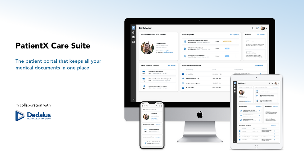
The PatientX Care Suite is a platform where patients can find and manage all relevant information related to a health facility in one central place. It offers a convenient and easy way to schedule appointments with their physician online. Additionally, it saves them valuable time during hospital visits by enabling them to sign consent forms in advance. Furthermore, patients can immediately see when radiological images or medical reports have been uploaded and directly share them with their physician in just a few clicks. Since the user group is so diverse, a big focus of the design was put on usability and a modern look and feel.
Objective and scope
The focus lied on designing an intuitive and responsive web interface for a great variety of different user groups. It needed to be appealing and easy to use for younger and elderly patients, as well as specialized health personnel. The scope of my work covered the main look and feel of the portal, the design of the dashboard and the whole image sharing use case of the portal. The second designer took care of the appointment scheduling use case, the medical form signing and the mobile app.
The target user groups are:
Patients
The primary beneficiaries of this portal are the patients. The goal is to save their valuable time by avoiding unnecessary paperwork and minimize error-prone processes. Overall their satisfaction with the healthcare system should be enhanced.
Relatives
When patients are underage, their parents or primary caregiver must be given access to help manage their documents and appointments. If desired, patients can also share access rights with their spouse or trusted family member for support.
Referring physicians
Another beneficiary is the referring physicians, that will equally save time by getting a better overview over their patients and their documents when given access. They can also directly schedule necessary appointments in a clinic for them.
Process
01.
User research
Competitor analysis
02.
User personas
Scenarios & flows
03.
Wireframes
First design drafts
04.
Review with team
First user interviews
05.
Iterate design
Interactive prototypes
06.
Usability tests
Responsive designs
User personas and scenarios


To cover the heterogenic target user groups, five different user personas have been created: two patients, one family member and one referring physician. Each user persona is accompanied by a detailed user scenario that describes their context and motivation of using the portal.
In this project, the set of features were already defined from the start by sales and product management. They did not consider primary research into patient preferences for an online portal as necessary, partly due to time constraints. This is why I started from an assumption that the greatest potential for the PatientX Care Suite lies in young and middle-aged adults, like Laura. Older patients, like Günther, are probably more skeptical to use technology for their medical appointments. They prefer to call personally but also might forget to bring in the right paper documents. At the same time, young doctors like Dr. Jovankovic that purchased the portal as support for their practice are potentially enthusiastic about the time-saving benefits over the long run, despite the potential extra effort at the start.
Design direction
With the patient personas and scenarios, I went on to design the first prototypes. Originally, I wanted to go more for a gamified design approach, to encourage patients to complete their profile and fill out the necessary forms on time. However, I went on and proposed three different design directions with varying degrees of freedom from our existing company design framework:
-
A playful, gamified approach (a completely new system)
-
A corporate healthcare application (strictly following our design system)
-
A clean, minimalist design (small deviations and new components possible)
For technical reasons the decision was taken that the design had to be based on the company’s existing design framework to avoid developing all components from scratch. At the same time, it was assumed that incorporating playful design elements might detract from the seriousness of the use case and that a clean look was more appropriate since the target group was so diverse. This is why we went for the second design direction where we could deviate slightly to create a modern look and be more appealing to the users. We could for instance not change colors, icons and design components but managed to introduce rounded corners, shadows as well as a new sidebar format.


Design idea 1: A playful, gamified approach
Design idea 2: A corporate healthcare application

Design idea 3: A clean, minimalist design - which ended up being chosen
User interviews
Initial semi-structured interviews were conducted early on with five potential test users, focusing only on the dashboard and document sharing use case. When first talking to them, I was mostly interested in what they would expect of a patient portal and which features it should entail, trying to catch up a bit on that missed out user research. Only then I showed them the first design drafts and flow and asked which information they would wish to see on the dashboard. Furthermore, I assessed how understandable the navigation was for them and which aspects of the dashboard and the document sharing use case they would like to see improved.
Findings
The most important requirement for the portal was to be clearly structured, fast and easy to use as well as not overloaded with information. Another important aspect for them was data privacy as they were aware of the sensitive nature of the information stored in the portal. When showing them the first design drafts, they appreciated the clean, modern appearance of the first design draft and could well imagine using the portal personally with adequate security measures in place. The navigation was perceived to be easily understandable. Moreover, they gave recommendations for additional functionality such as personalizing the dashboard as well as adding contact information of their treating physician. This was however neglected by product management as other planned features had higher priority.

A cleaned up version of the dashboard: a fixed widget height, no pictures in notes and new document grid

Document sharing offers a simple overview over the patient's shared documents


Medical images can be opened over an embedded viewer application
The user can upload documents and share them with their physician
A suggested timeline view did not add value to users and was rejected
Responsive design
A key aspect of the design was responsiveness as the patient portal should be usable across various devices. The target group should have seamless access from desktop computer, laptop, tablet and smartphone. As the company’s design framework is not responsive by default, we could not start with a mobile first approach but had to work the other way around. Starting from the screens I had already build for desktop (1920x1080), I downsized step by step and fitted them onto smaller screen sizes by performing necessary layout changes accordingly. The main change which also had an influence on the overall dashboard involved establishing a fixed height for the widgets. This adjustment was necessary to be able to arrange widgets in a stacked manner without any conflicts or gaps between them. Another bigger change was to remove the different filter options in the document sharing space for a smartphone screen. We assumed that users would not want to spend time clicking through several filters on a phone but rather just open one of the latest documents or eventually use the remaining full-text search bar.


Usability test
After a functional deployment of the patient portal was implemented, a comprehensive usability test was conducted. While my focus of interest remained on the dashboard and the document sharing functionality, additional aspects were also tested this time, including the registration process, appointment booking and creating a task. This broader scope allowed for a more holistic evaluation of the user experience across key interactions within the portal. The feedback of the six test users was overwhelmingly positive regarding the appearance and ease of use of both the dashboard and the document sharing features. Several suggestions for additional features were made, such as the ability to sort documents in different ways and better feedback when deleting a document. After the test, the feedback was carefully analyzed and suggested improvements were prioritized for implementations. Two implemented points are for example the filtering options and the fullscreen mode of the embedded diagnostic viewer.
Limitations
-
Since this project was initiated within a corporate setting, the set of features had already largely been set in stone by sales and product management. This still made competitor analysis and usability testing possible for the proposed solution, but I would have preferred starting with a clean slate, allowing for greater exploration of alternative feature options.
-
Additionally, this product was developed together with a second business unit that follows different processes and culture. Collaborating with them proved to be challenging as they did not work with mockups and prototypes but started with functionality first and adjusted the design later if time remained. This made it near impossible to keep a consistent look over the whole application and unfortunately forced me to accept inconsistencies when it came close to the release deadline.
-
Moreover, the design process was limited by the requirement to stay close to the existing design framework. While this spoke for brand identity and faster development, there was less room left for creative freedom for designers. With every small deviation also came the need to check back with R&D if it would not exceed the scope and many times compromises had to be made.
Learnings
-
Despite - or maybe especially due to - many limitations, this project proved to be full of learnings. Looking for compromise due to set guidelines, technical or timeline restraints while trying to keep the look and feel in every use case was an inviting challenge. Balancing this need for adherence to guidelines with the desire for innovation and usability required careful consideration and problem-solving skills and made me grow significantly as a designer. Moreover, it was the first time I designed all screens for different screen sizes which made me learned a lot about responsive design overall. Finally, having the opportunity to craft the vision for the product in the beginning and seeing it come to fruition elicited a special sense of accomplishment. At the same time, seeing the positive reactions of both team members and test users as a direct impact of your design decisions was very rewarding.